
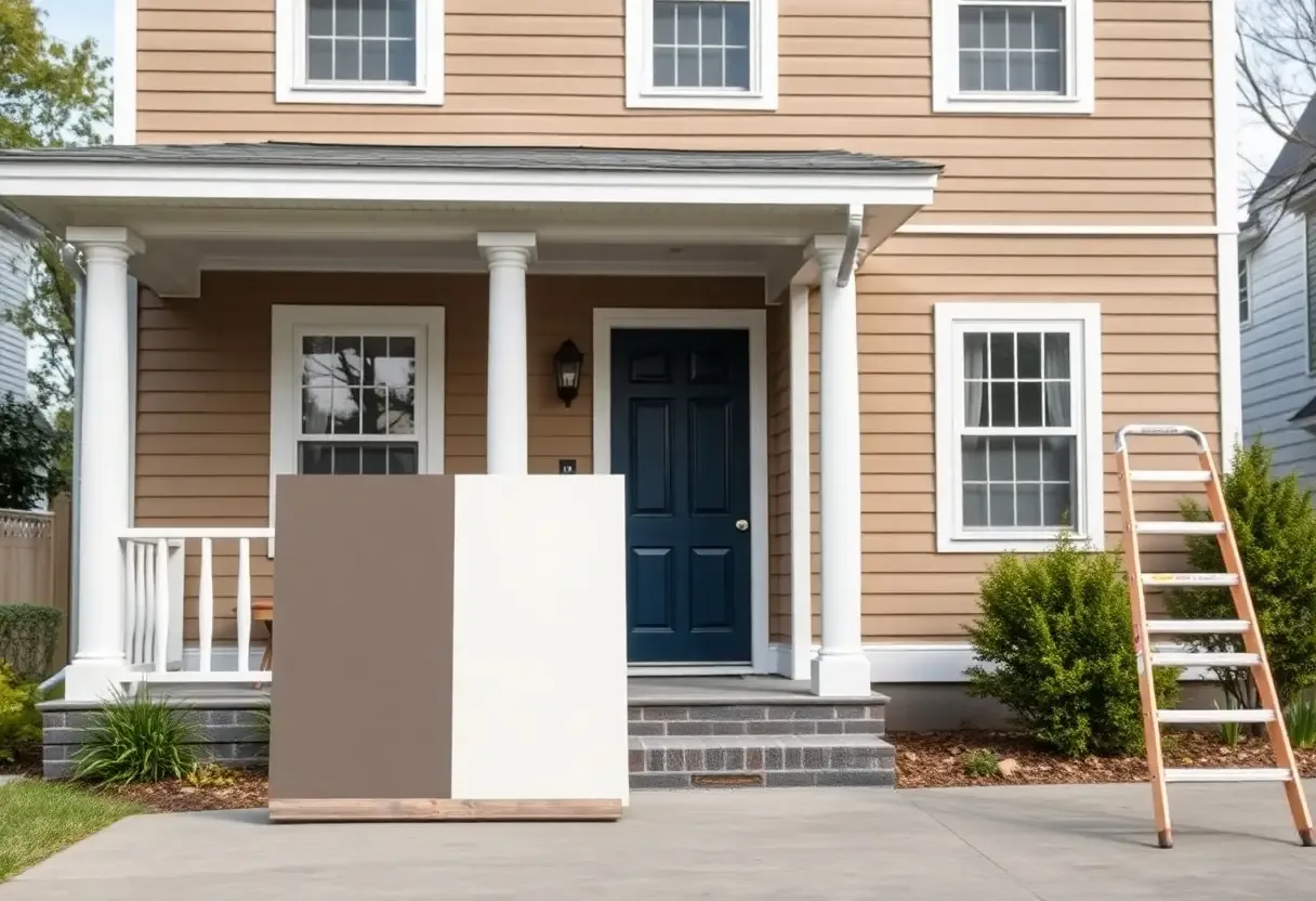
Paint your home's exterior with timeless colors that resist trends and maintain appeal. Choose neutral bases with balanced undertones to avoid harsh contrasts. Test samples in different lighting to see how they age. Avoid overly bold hues — they fade fast and scream "out of style" within months. Stick to proven palettes that enhance your architecture.
Key Takeaways
Your home's architectural style and era should guide color selection — ignoring this context risks a mismatched look.
Fixed elements like brick, stone, and roofing limit your palette; choose paint that complements them rather than fights them.
Test large swatch patches on multiple elevations and observe them at different times of day before committing.
High-saturation trendy hues age quickly — neutral bases and earth tones deliver beauty and lasting resale value.
Environmental and Structural Factors to Consider
Light, climate, and surrounding landscape shape how exterior paint colors appear over time. Consider your home's exposure to sun, shade, and moisture, as these affect fading and wear. Fixed elements like brick, stone, and roofing limit your palette. The right color choice respects these constraints and ensures lasting harmony.
Assessing the home's architectural style and era
Your home's architectural style guides appropriate color choices. Craftsman bungalows often suit earthy tones, while mid-century homes embrace deeper, neutral hues. Ignoring this context risks a mismatched look. The era-appropriate palette preserves authenticity and long-term appeal.
Harmonizing with fixed masonry and roofing materials
Brick, stonework, and roofing don't change easily, so your paint must complement them. A red brick facade calls for undertones that echo its warmth. Cool grays may clash if not balanced. The fixed materials set the foundation for a timeless exterior scheme.
Matching paint to permanent features prevents future regret. If your roof has terra cotta tiles, lean into warm neutrals instead of stark whites that heighten contrast. Natural stone with gray and rust tones pairs best with muted sage or greige. The goal is cohesion — letting your paint enhance, not fight, what's already in place.
How to Construct a Multidimensional Color Palette
Building a multidimensional palette means going beyond a single wall color to create depth and visual interest. You're not just painting surfaces — you're shaping how light, texture, and proportion interact. A well-layered scheme withstands trends by relying on balance rather than momentary style.
Determining the dominant field color for the body
Start by identifying the largest visible surface — this is your dominant field color. Choose a shade that responds to your home's architecture and environment. Neutral bases with subtle undertones adapt best over time, avoiding the risk of looking outdated as trends shift.
Selecting complementary accent and trim transitions
Accent and trim colors define architectural details and create contrast. Pick hues that support, not compete with, the dominant field. Too much contrast ages quickly, while thoughtful tonal shifts add sophistication without dating the design.
Think of trim and accents as the punctuation in your home's visual language. A crisp white may seem timeless, but its effect depends on undertones matching the main color. Warm grays, soft blacks, or muted earth tones often make more enduring choices for trims and shutters. Test combinations in natural light at different times of day — what looks balanced at noon may appear harsh at sunset. The goal is harmony that feels intentional, not forced.
Essential Tips for Real-World Color Testing
Observe paint samples in direct sunlight and shade to see true undertones. Test on multiple exterior surfaces like stucco, wood, and trim. Wait 24 hours to assess how the color settles and reacts to weather. You will avoid costly repaints by seeing how pigments shift in real conditions.
Evaluating samples during different times of day
You notice how morning light pulls cool tones while afternoon sun intensifies warmth. Colors transform dramatically from dawn to dusk, revealing hidden grays or yellows. Watch how shadows from trees or eaves affect appearance. This daily shift determines whether your chosen hue stays balanced. You will gain confidence in a choice that looks consistent across changing light.
Applying large-scale test patches on multiple elevations
A small swatch misleads; a broad patch reveals the truth. Paint at least 2×2-foot sections on different sides of your home to account for sun exposure and architectural angles. Flat samples on a board don't mimic real wall behavior. You will spot unwanted glare, flatness, or intensity only visible at scale.
When you apply large test patches on multiple elevations, you simulate the final effect under authentic conditions. North-facing walls often appear cooler and darker, while south-facing areas amplify brightness and can make colors look washed out. By testing across surfaces, you uncover how adjacent materials like brick, stone, or roofing influence the paint's appearance. This step prevents surprises after the full rollout and ensures harmony with your home's surroundings and design lines.
Utilizing Classic Hues for Lasting Appeal
Time-tested colors stand the test of time because they adapt to shifting trends without losing their charm. You'll find that classic hues like warm whites, soft grays, and muted blues offer long-term satisfaction and resale value, blending effortlessly with future landscaping or architectural updates. These shades avoid the risk of looking trendy one year and tired the next.
The versatility of sophisticated neutrals and greiges
Neutrals and greiges blend warmth and balance, making them ideal for exterior palettes. You can pair them with almost any trim or accent color, ensuring your home maintains a sophisticated, modern look for years. Their subtle complexity hides wear and tear better than stark whites or cool grays.
Incorporating nature-inspired earth tones for organic warmth
Earth tones drawn from natural landscapes — like warm terracotta, mossy green, or sandy beige — add organic warmth without feeling outdated. You'll notice these shades harmonize with surrounding foliage and stone, creating a grounded, inviting exterior that feels at home in any season.
Earth tones succeed because they reflect real-world environments, not fleeting fashion. When you choose a color like weathered clay or forest sage, you're aligning with nature's own palette — one that doesn't go out of style. These hues handle sun exposure gracefully, age beautifully, and often enhance a home's architectural character rather than overpower it. The subtle depth in these colors masks dirt and fading, giving you both beauty and practicality.
Protecting Your Investment Against Rapid Aging
Choosing exterior paint colors with staying power saves you money and hassle over time. High-saturation fads may look bold today but often feel overwhelming just years later. Stick to hues that complement your home's architecture and surroundings to ensure lasting appeal.
Identifying and avoiding high-saturation color fads
You'll see bold teal, neon gray, or intense purple pop up on trend-focused homes. These high-saturation shades often dominate social media for a season — then look dated fast. Opt instead for muted versions or earthy alternatives that age gracefully.
Balancing modern aesthetics with long-term resale value
You can embrace contemporary style without sacrificing broad buyer appeal. Neutral bases with subtle character — like warm greige or soft charcoal — allow for modern flair while remaining inviting to future buyers.
Modern design doesn't require dramatic color choices to feel current. A crisp white with black trim or a warm taupe with natural wood accents delivers clean lines and timeless contrast. These combinations feel fresh today and won't alienate buyers down the road, ensuring your home maintains both aesthetic and financial value.
Frequently Asked Questions
How do I choose exterior paint colors that will still look fresh five years from now?
Focus on neutral or earth-toned base colors like warm grays, greiges, soft beiges, or muted blues. These shades tend to age well because they complement changing landscaping, seasonal light, and evolving neighborhood aesthetics. Avoid overly trendy colors like bold navy, black exteriors, or bright modern hues that can feel dated quickly. Test your chosen colors on multiple sides of the house and observe them at different times of day. A color that looks balanced in morning light might appear too cool or too warm in the afternoon. Choosing a tone with balanced undertones — neither too pink nor too green — helps maintain a timeless appearance.
Should I match my home's exterior color to my neighbors' houses?
You don't need to match your neighbors exactly, but it helps to consider the overall character of your street. Homes that clash dramatically with their surroundings can feel out of place, even if the color choice is technically appealing. Look for ways to coordinate through tone and intensity rather than copying colors. For example, if most homes on your block use warm-toned siding, choosing a cool gray midnight stand out too much. Instead, pick a warm gray or greige that fits the neighborhood mood while still expressing your taste. Architectural style also matters — Craftsman homes often suit earthy greens and browns, while mid-century homes can handle deeper charcoals or warm taupes.
Can the material of my home's exterior affect how paint colors age?
Yes, the surface material changes how color appears and holds up over time. Brick, stucco, wood, fiber cement, and metal siding each absorb and reflect light differently. A color that looks soft and warm on a paint swatch might appear harsh on reflective vinyl siding in full sun. Textured surfaces like stucco can make colors look deeper or mottled, so smoother, more uniform tones often work better. Also, darker colors on materials like wood can lead to warping or faster fading due to heat absorption. For long-term appeal, select colors that work with your material's natural characteristics and local climate — lighter shades often endure better in sunny regions, while cooler areas can support deeper tones without excessive heat damage.
Summing Up
On the whole, you build lasting curb appeal by choosing exterior paint colors rooted in your home's architecture and surroundings. Stick to timeless neutrals, test samples in different lights, and avoid chasing trends. Your color choice should age gracefully, so pick shades that feel balanced and authentic to your home's character. When you're ready to put the plan into action, our exterior painting team serves Huntingtown, Sunderland, Owings, Dunkirk, and Calvert County — call (443) 684-4101 for a free estimate.
More reading
More From the Crew
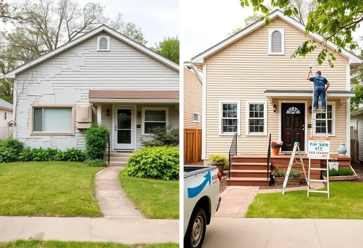
Exterior Painting7 min
How a Professional Paint Job Can Increase Your Home's Value
A well-executed professional paint job is one of the most cost-effective upgrades you can make — boosting curb appeal, protecting surfaces, and signaling careful maintenance to buyers.
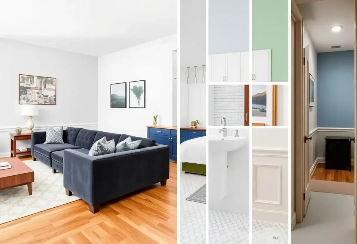
Interior Painting7 min
Room-by-Room Interior Painting Ideas for a Fresh New Look
Strategic color choices transform every room — from the living room salon to the bathroom bathing chamber — here are the palettes that work best in each space.
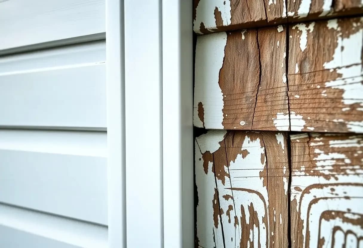
Exterior Painting4 min
How Exterior Paint Helps Defend Your Home Against Moisture Damage
Quality exterior paint is far more than color — it's the waterproof shield that keeps rain, humidity, and ground moisture from rotting your siding and walls.